Transforming fulfillment efficiency through experience redesign
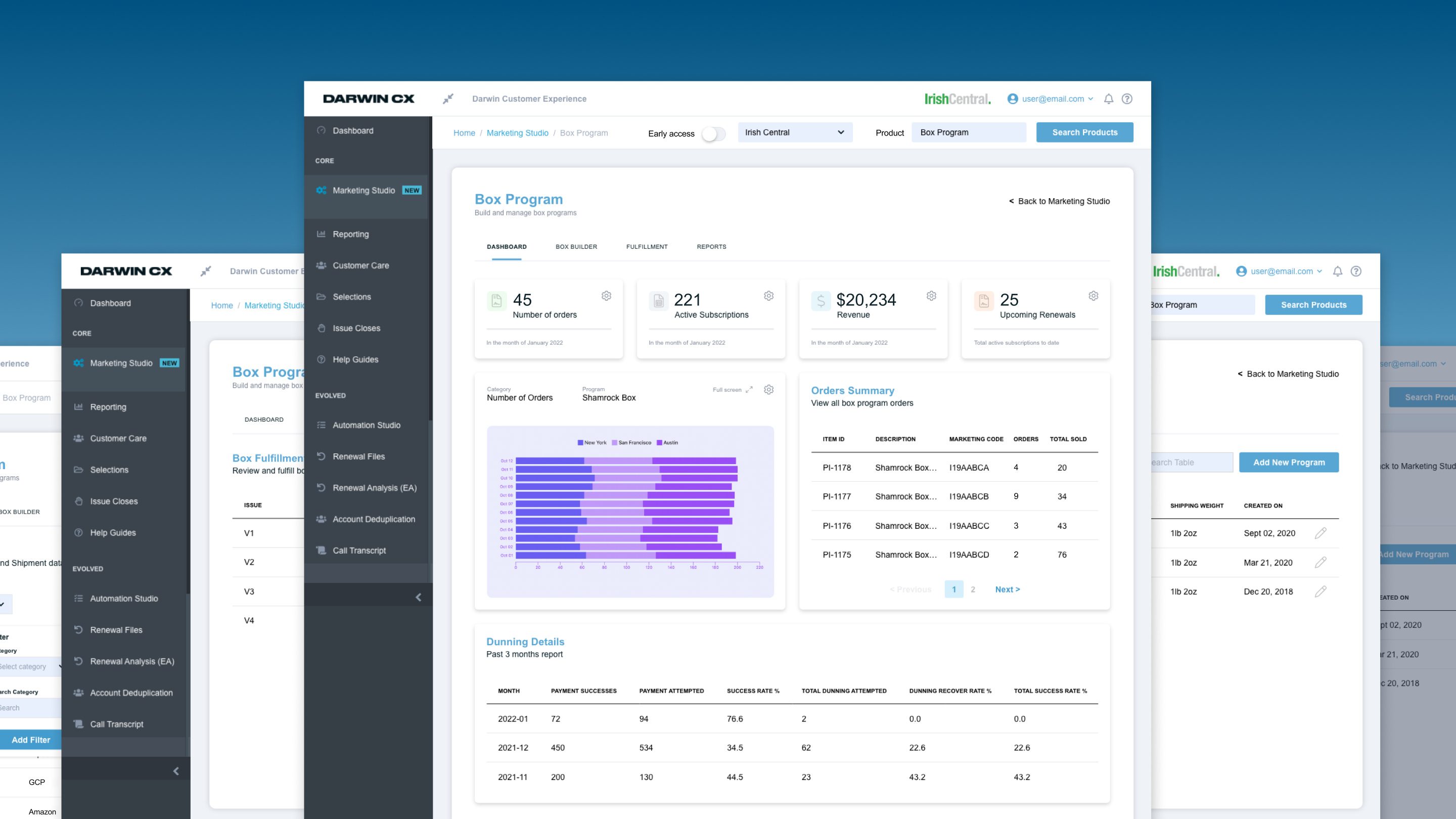
DarwinCX is a B2B publishing platform where fulfillment plays a mission-critical role. I led the redesign of the Segment Builder—the most heavily used component of the system. The existing experience was manual, error-prone, and frequently required support intervention. By grounding the redesign in user research and simplifying both workflows and system interactions, we significantly increased productivity and reduced human error across fulfillment operations.
A core workflow that was slowing the business down.
The fulfillment Segment Builder was:
Time-consuming workflows with excessive repetitive tasks.
High cognitive load leading to frequent data entry mistakes.
Lack of hierarchy made finding information difficult.
Unclear system feedback slowed down fulfillment cycles.
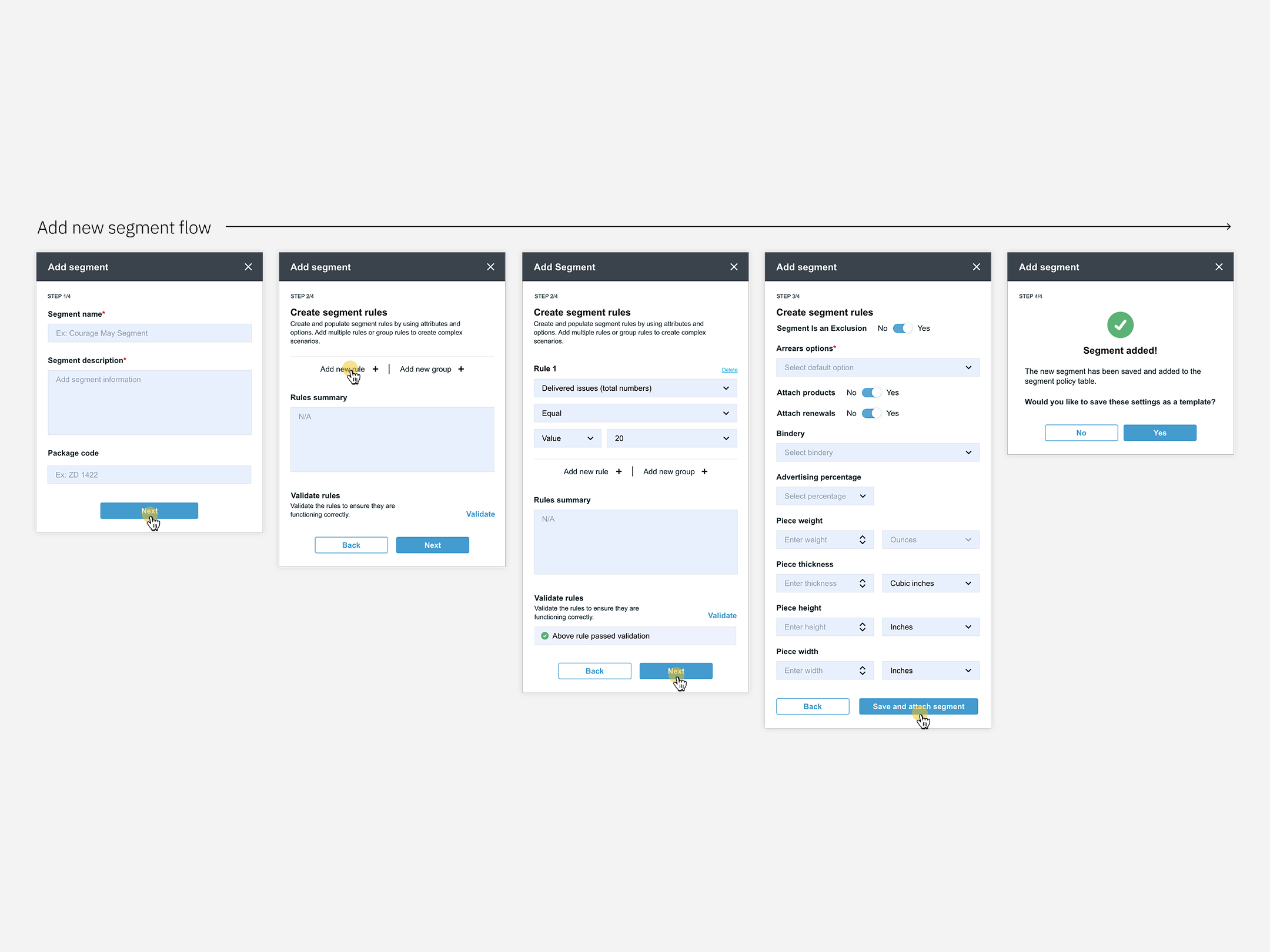
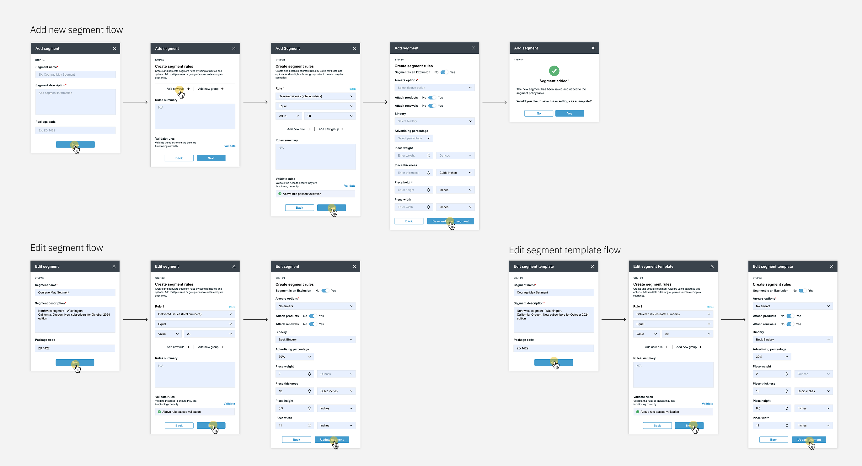
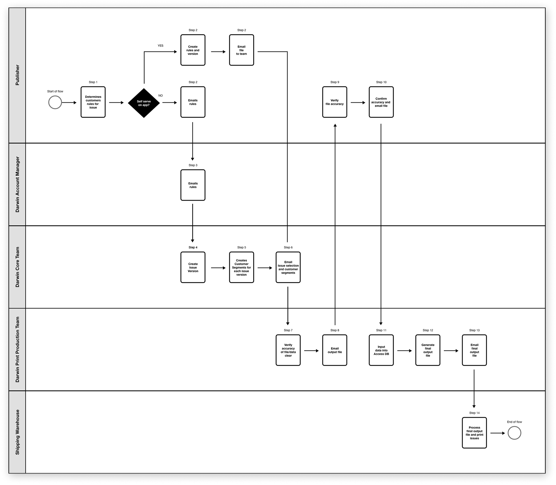
E2E redesign of the Segment Builder, from auditing the current tool to delivering dev-ready specs.
Research revealed deep usability issues and systemic breakdowns across teams.
JTBD: When fulfilling orders, I need a reliable tool so I can process work quickly and without errors.
Pain points:
JTBD: When creating campaigns, I need an intuitive system to accurately target user groups.
Pain points:
"This wasn’t just a UI problem—it was a system design problem."
— Design Takeaway
Measured before redesigning.
This baseline allowed us to objectively measure post-launch impact.
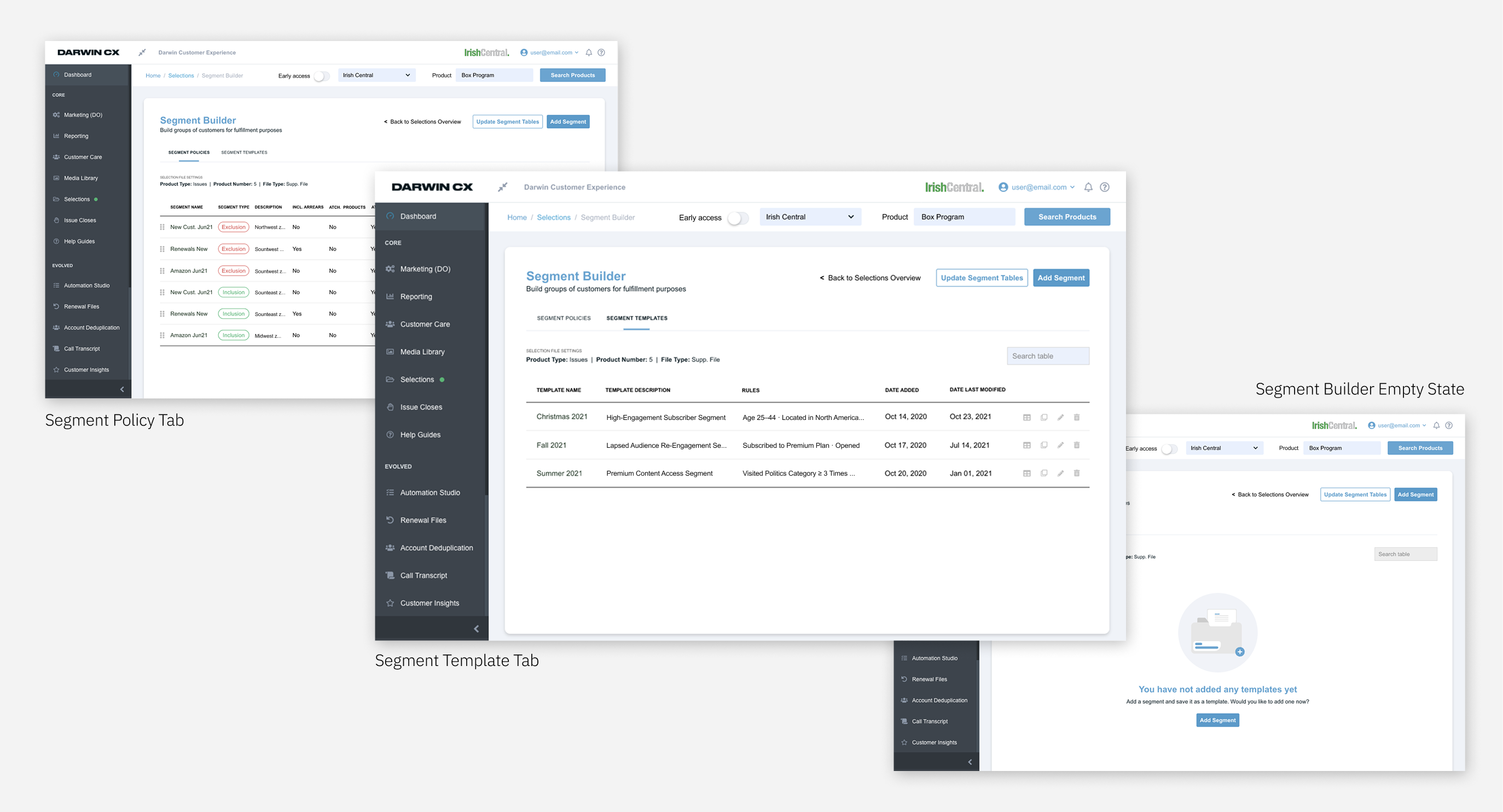
Simplified the system by redesigning the workflow.
Conducted iterative reviews and collaborative workshops with the Fulfillment Team to refine sketches and wireframes.
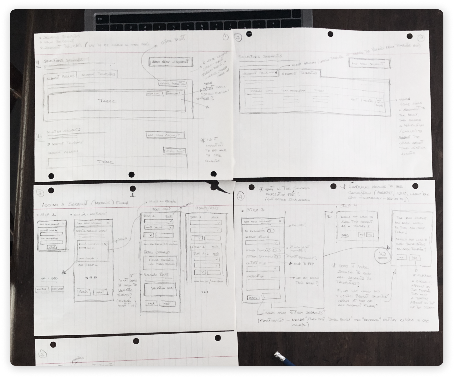
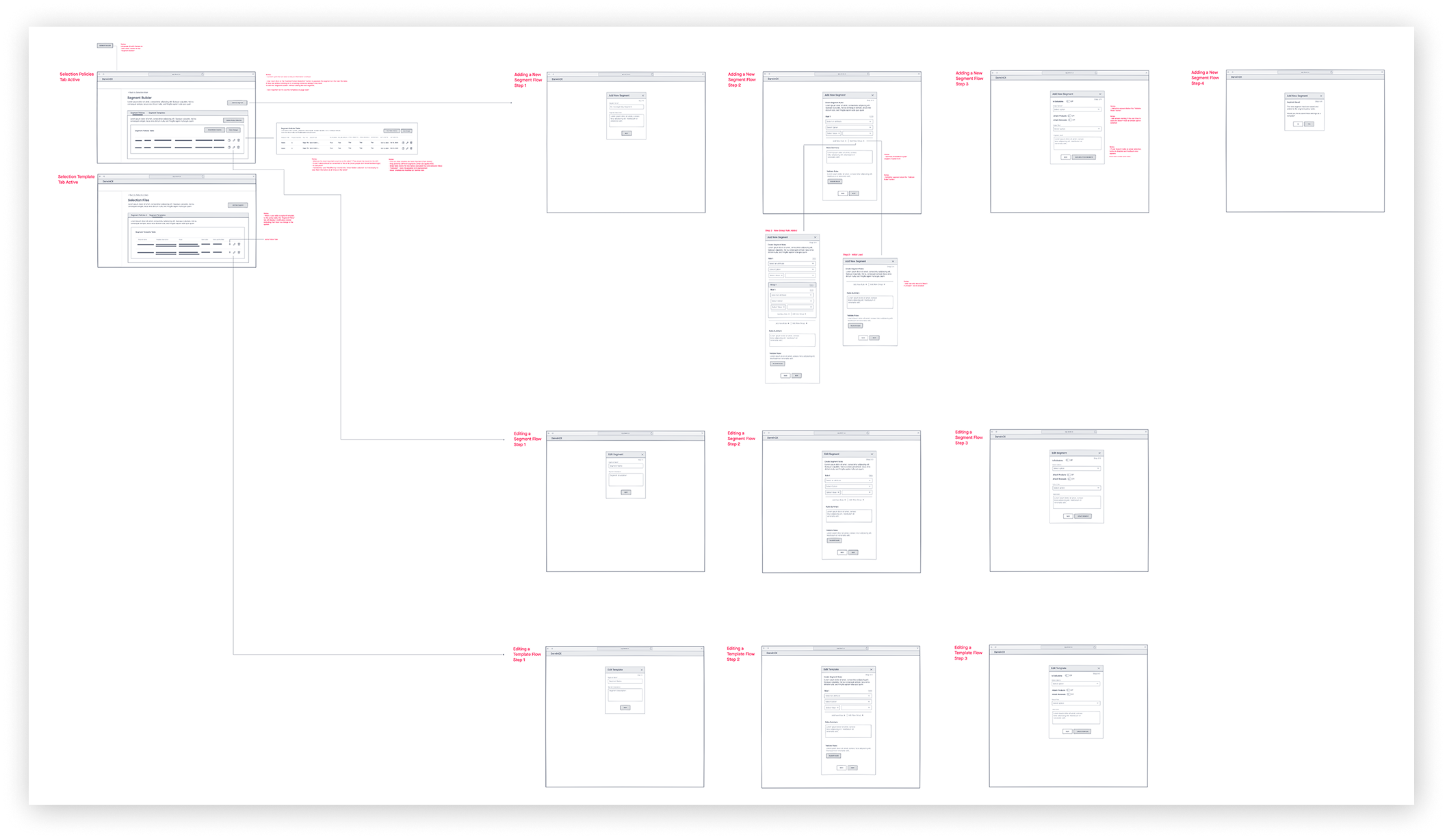
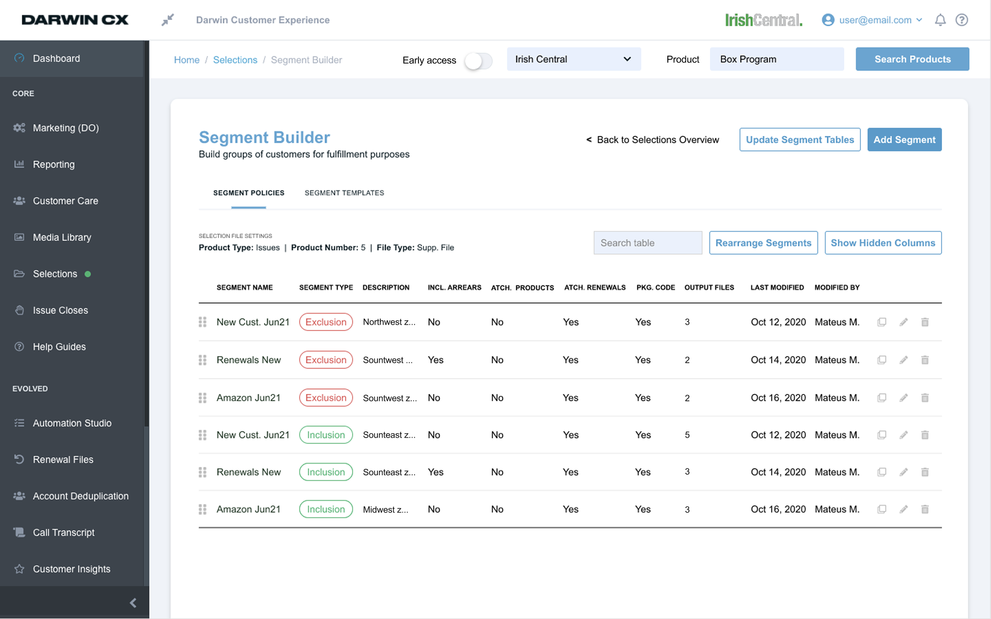
Reduced steps. Increased clarity.
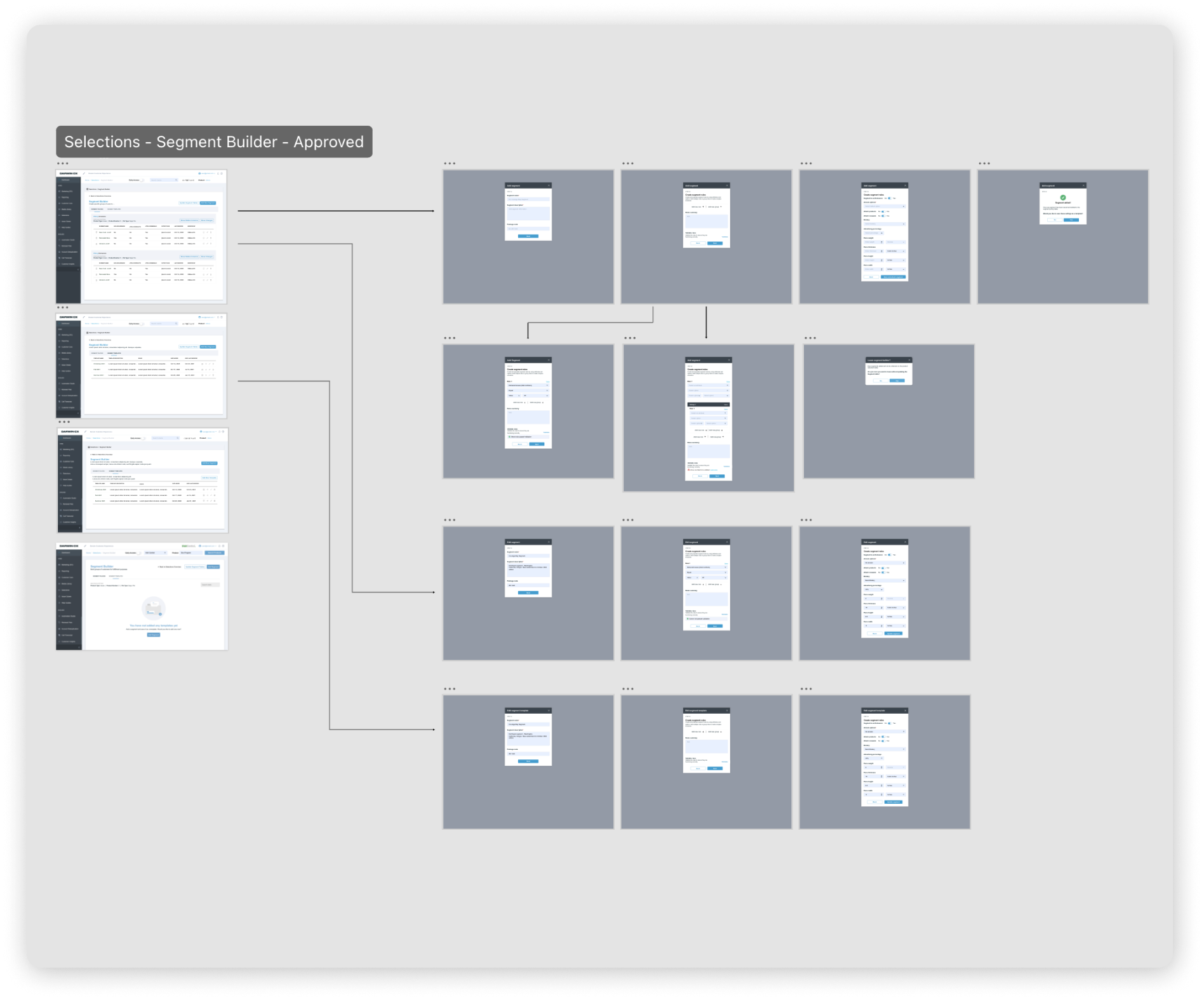
Designed for speed, clarity, and error reduction.
The solution was tested and validated with the Fulfillment team prior to development, ensuring it reflects the needs of the people who use it most.
From confusing and manual → structured and efficient